Website Concept · Luxury beauty and wellness
Maison Lune
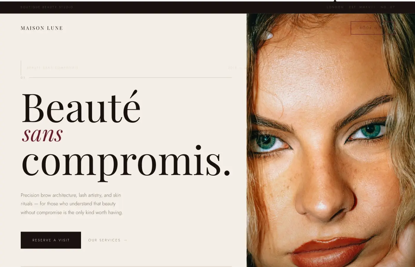
A beauty-studio website study exploring premium identity, service discovery and conversion without visual excess.
01 · Challenge
The design problem.
How can a beauty studio use bold image-making and fashion-editorial pacing while keeping service information and consultation pathways calm?
02 · Objectives
What I wanted to achieve.
- 01Let portrait photography set an immediate point of view.
- 02Keep service discovery structured beneath the editorial layer.
- 03Use conversion actions sparingly and consistently.
- 04Maintain drama without sacrificing mobile legibility.
03 · Design direction
A clear visual point of view.
Cream and black create the central tension, while deep burgundy marks the most intentional actions. Dramatic portrait crops, high-contrast serif typography and quiet service labels give the concept a fashion-editorial pace.
Design principles
- 01Lead with emotion
- 02Let imagery speak
- 03Use contrast with purpose
- 04Guide with clarity and calm
- 05Details should elevate the experience
04 · Final design
Selected direction

Earlier directions
Two quieter routes explored before the selected direction.
Concept 1

Concept 2

05 · Reflection
What stayed with me.
This study reinforced that luxury is more convincing when the interface knows when to become quiet. The most useful tension came from pairing expressive portraits with a very controlled information layer. I would next extend the treatment-detail and consultation-preparation experiences.
06 · What I explored
The threads inside the work.
- Premium visual direction
- Beauty service hierarchy
- Conversion with restraint
- Editorial luxury